Note
Go to the end to download the full example code
Loading a touchstone file and plotting scatter matrices
This example illustrates how to load in a touchstone file and then use the visualize and visualize_map methods
of the SMatrix1DSweep class to plot scatter matrices.
Please download the touchstone file for this example: dircoup.s4p before running the sample.
See also
import ipkiss3.all as i3

smat = i3.device_sim.SMatrix1DSweep.from_touchstone("dircoup.s4p")
visualize
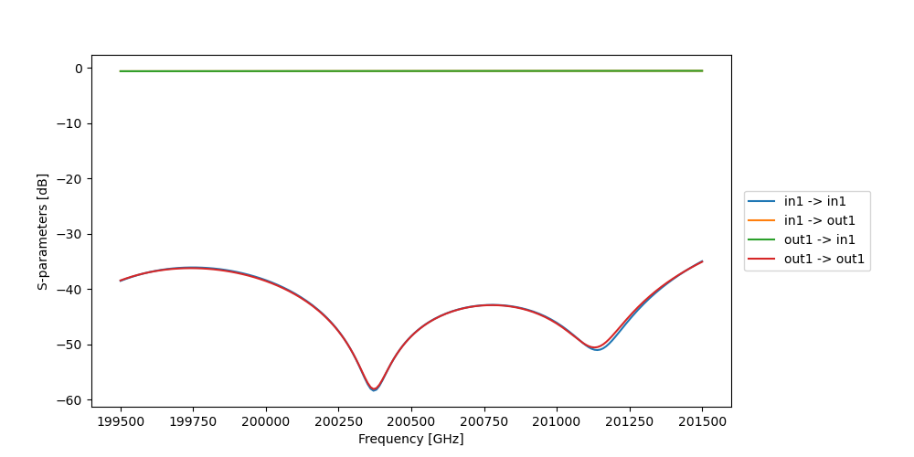
You can use visualize to plot specific elements in the frequency domain.
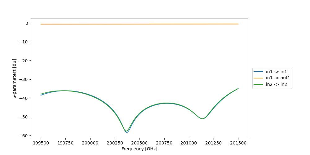
There are 2 options to assign what S parameters need to be plotted:
- You can use terms. This will plot all the S parameters with both ports in the terms list.For example: terms = [“in1”, “out1”]. The S parameters plotted will be: S11, S12, S22 and S21.
- You can also use term_pairs. All the S parameters that need to be plotted are specified in this list of tuples.For example: term_pairs = [(“in1”, “in1”), (“in1”, “out1”), (“in2”, “in2”)].
The S parameters plotted will be: S11, S12, S33.
smat.visualize(terms=["in1", "out1"], figsize=(10, 5), scale="dB")
smat.visualize(term_pairs=[("in1", "in1"), ("in1", "out1"), ("in2", "in2")], figsize=(10, 5), scale="dB")
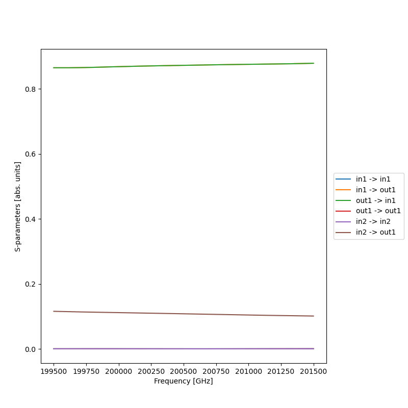
You can also use a combination of these 2 by delaying the plot rendering using show=False, and passing the figure to the second plotting call. The scale can either be “linear” or “dB” using the scale option.
figure = smat.visualize(terms=["in1", "out1"], figsize=(10, 5), scale="linear", show=False)
smat.visualize(term_pairs=[("in2", "in2"), ("in2", "out1")], scale="linear", figure=figure)
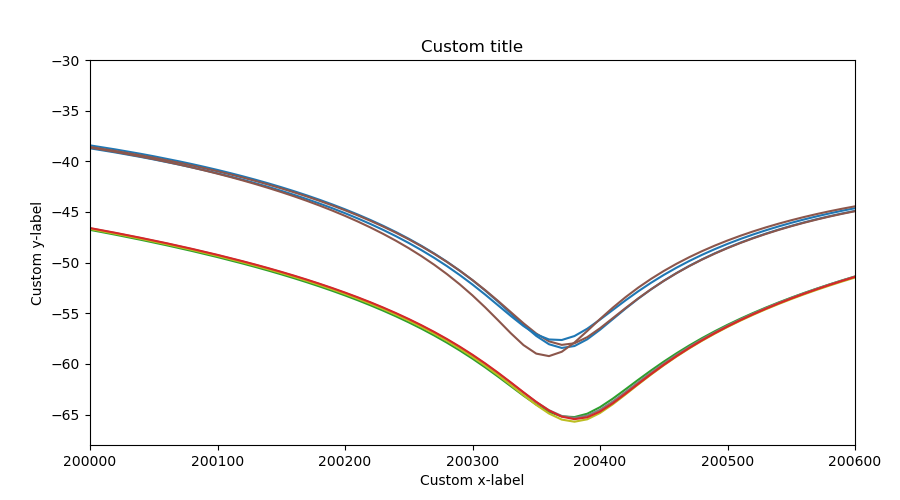
If there is no terms or term_pairs, all elements of the s-matrix are plotted. There are a lot of customisation options. You can add the title or change the x and y labels using title, ylabel and xlabel. The legend can be removed by setting legend to false. The y and x-axis can be shortened by using xrange and yrange. If more customisation options are wanted, you should use the returned figure instead. The figure can also be saved using save_name.
smat.visualize(
    figsize=(9, 5),
    scale="dB",
    xlabel="Custom x-label",
    ylabel="Custom y-label",
    title="Custom title",
    legend=False,
    xrange=[200000, 200600],
    yrange=[-68, -30],
)
visualize_map
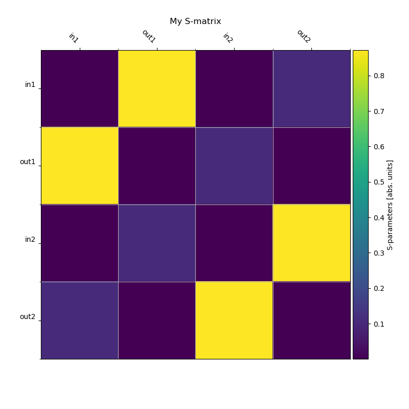
visualize_map plots the S-matrix at a specific frequency or wavelength as a map.
smat.visualize_map(scale="dB", sweep_value=201000)
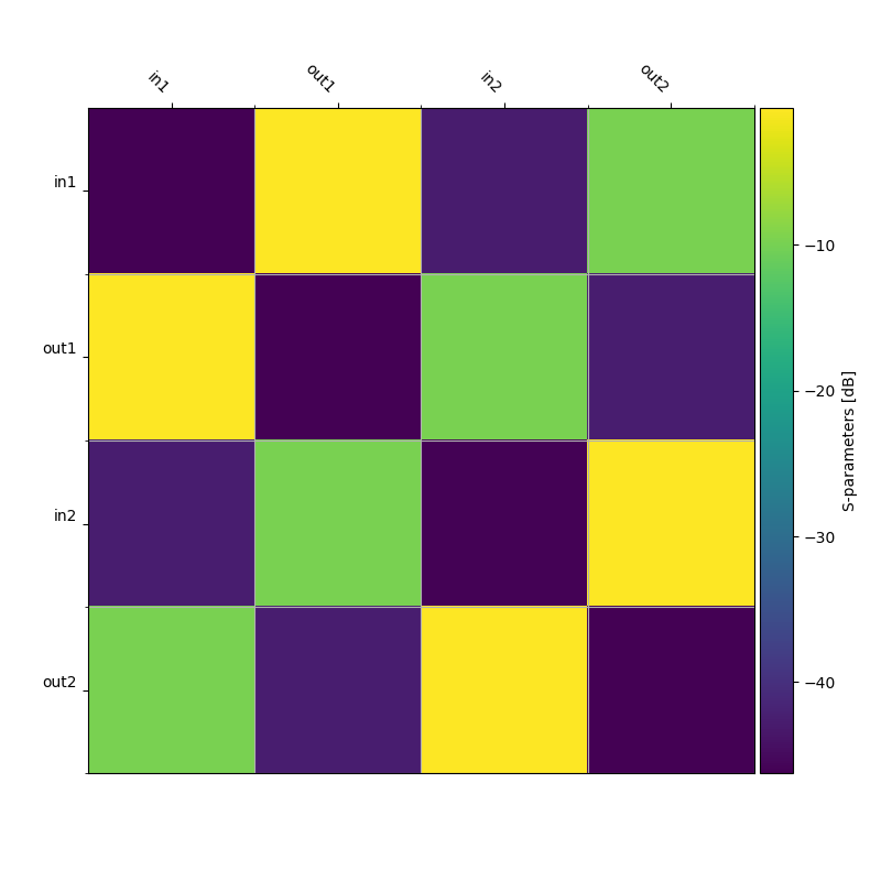
When no sweep_value is given, the center sweep value will be chosen instead. If a value is chosen that is not in the data, the closest frequency or wavelength will be chosen instead. figsize, scale, title, ylabel, fig and savename work in exactly the same way as visualize.
smat.visualize_map(scale="linear", title="My S-matrix")
